

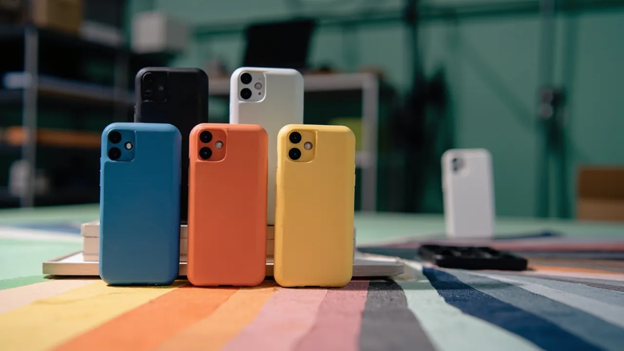
Yes, but color freedom is bounded by three constraints: the material system, the minimum order quantity for masterbatch, and the surface texture and lighting conditions of the finished part. The same Pantone reference looks different on PP, ABS, and PC. The same masterbatch reads noticeably differently across texture depths and surface finishes. Color customization is therefore not a matter of quoting a reference number and starting production. It is a complete chain running from material confirmation and masterbatch formulation through color plates, pilot production, and color difference acceptance.
Most color problems in real projects look alike. A buyer brings a Pantone reference from the brand manual, the supplier runs the nearest general purpose masterbatch, the customer says it is wrong, sampling repeats, time is consumed, and the outcome is either a compromise on an inaccurate color or the discovery that the custom masterbatch minimum far exceeds the whole order. The root cause is that most suppliers will not volunteer that your requested color cannot be achieved on your chosen material, and buyers do not know what to ask. This guide covers the constraints on color matching, the basics of masterbatch formulation, the five sources of color deviation, the specific difficulties of dark and light shades, Delta E judgment and acceptance methods, compatibility with weathering and flame retardance, and the controls for color plates and batch consistency, with a judgment table you can use directly at both inquiry and acceptance.
Table of Contents
- 1. Three Hard Constraints on Color Customization
- 2. Expressing Color: Pantone References and Color Difference Systems
- 3. Masterbatch Composition and Key Components
- 4. How Coloring Differs Across Material Systems
- 5. The Five Sources of Color Deviation
- 6. Process Challenges with Dark and Highly Saturated Colors
- 7. Special Issues with Light and White Cases
- 8. Color Difference Judgment and Acceptance Standards
- 9. Weathering and Fading: Aging Validation Essentials
- 10. Compatibility Between Flame Retardant Materials and Color
- 11. Color Plates and Batch Consistency Control
- 12. Cost, Minimum Order, and Lead Time Impact
- 13. How JUNZHJIA Supports Color Matching
- 14. Resolving Common Color Complaints
- Frequently Asked Questions
- Conclusion and Further Reading
1. Three Hard Constraints on Color Customization
Before promising a customer that a color is achievable, confirm three constraints.
First, the material system. PP, PE, ABS, PC, and engineering compounds behave very differently under coloring. Some materials are naturally yellow, requiring more opacity to render light shades. Some are sensitive to particular pigments at high processing temperatures and shift color. Others have low surface energy, so once textured, their light scattering differs from a polished surface, and the same reference reads differently on the two finishes. Once the material is fixed, the achievable color gamut is essentially framed.
Second, the masterbatch minimum order quantity. The color house sets a minimum, so the molder must buy the full lot even for a small production run. That means the economic threshold for customization sits at the masterbatch stage, not at the injection stage. If the order quantity falls below what the masterbatch minimum can cover, the most realistic option is one of the supplier's existing colors.
Third, surface condition and lighting. Deeper, coarser texture increases diffuse reflection, making the same reference look lighter and flatter, while a smooth or glossy surface looks darker and more saturated. Customers also see different colors under showroom lighting, daylight, and warehouse fluorescents. Any color difference judgment must specify both the light source and the viewing angle, otherwise disputes cannot be resolved.
2. Expressing Color: Pantone References and Color Difference Systems
Pantone references are the common language of brand communication, but a reference is not itself a precise physical quantity. Three points matter.
First, Pantone has multiple systems. The textile and home system (TCX) and the graphic system (C and U) use different formulations and render differently. The same number is not exactly the same color across systems, so quotations and samples should state which system applies.
Second, physical Pantone books fade with use. Paper swatches drift after long exposure to light, so rigorous acceptance should not rely on a book that has been in service for years. It should rely on a standard color plate signed and sealed by both parties.
Third, the reference is a target, and deviation must be quantified. Standard practice uses the CIELAB color space to compute color difference, expressed as Delta E for overall difference, with Delta L for lightness, Delta a for the red-green axis, and Delta b for the yellow-blue axis. This converts "it looks a bit different" into a number that can be judged, recorded, and traced.
| Concept | Meaning | Typical use |
|---|---|---|
| --- | --- | --- |
| Delta E, overall difference | Combined value of lightness and chromatic deviation | Overall judgment for batch acceptance |
| Delta L | Lightness difference, positive is lighter, negative is darker | Judge whether the batch runs dark or light overall |
| Delta a | Red-green chromatic difference | Judge whether the batch skews red or green |
| Delta b | Yellow-blue chromatic difference | Judge whether the batch skews yellow or blue |
| Visual rating | Multiple observers compare against the standard under a specified light source | Common in customer internal color standards |
Note that Delta E does not map linearly to visual perception. Empirically, on the same material and surface condition, small overall differences are hard to see, but when Delta L alone is large, the eye readily perceives a lightness mismatch even if the overall Delta E is modest. Acceptance rules therefore usually cap both the overall value and individual components.
3. Masterbatch Composition and Key Components
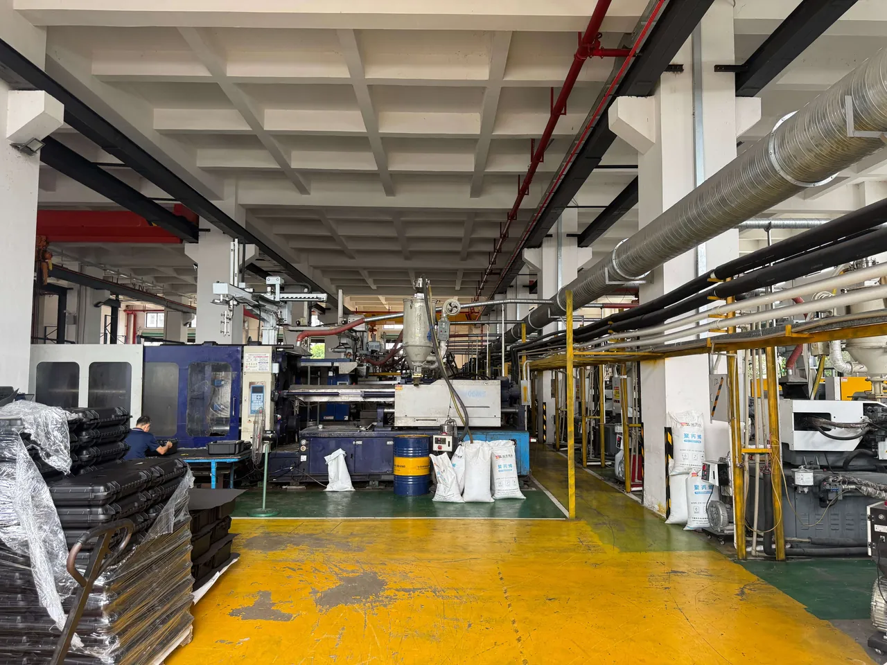
Masterbatch has three parts: pigment or dye, carrier resin, and the dispersion and additive system.
Pigment and dye selection determines weathering, heat resistance, and opacity. Inorganic pigments generally offer better weathering and heat resistance but limited saturation. Organic pigments are vivid but may fade under high heat or prolonged sunlight. Dyes have strong tinting strength and transparency but poor migration resistance and can bleed under prolonged contact. Outdoor cases should favor pigment systems with higher weathering grades.
Carrier resin must be compatible with the case substrate. A mismatch causes poor dispersion that shows up as color specks, streaks, or surface pitting. If the case uses an engineering compound, the masterbatch carrier should match it rather than defaulting to a general purpose carrier.
The dispersion system determines color uniformity. Poor dispersion is one of the most common causes of color inconsistency within a single shipment. Thin wall parts and long flow paths demand higher dispersion quality.
Addition ratio is equally critical. Too low a masterbatch ratio produces pale color and uneven dispersion. Too high can affect mechanical properties and flame retardance. Empirically, the ratio should be established and locked during the color plate stage and followed strictly in production, never adjusted by operator eye.
4. How Coloring Differs Across Material Systems
| Material | Natural undertone | Difficulty of light or white shades | Typical coloring issues | Recommendation |
|---|---|---|---|---|
| --- | --- | --- | --- | --- |
| PP | Milky, semi-transparent | Moderate, needs good opacity | Low temperature brittleness and carrier matching | Use a matched carrier, watch low temperature toughness |
| PE | Milky, waxy | Moderate | Poor printing and bonding adhesion | Evaluate coloring together with post-processing |
| ABS | Cream to beige | Relatively easy | Yellows under prolonged sunlight | Choose a weathering system for outdoor parts |
| PC | Slightly yellow, transparent | White is harder, needs high opacity | Color shift at high processing temperature | Control process temperature and masterbatch heat resistance |
| Filled or glass fiber compounds | Depends on filler | Harder, uneven surface | Fiber show-through causes color mottling | Raise dispersion requirements, assess fiber show |
| Regrind blends | Highly variable | Difficult | Significant batch to batch deviation | Limit regrind ratio or fix the blend ratio |
The table makes one point clear: the same reference will necessarily render differently across materials. This is material nature, not a supplier capability problem. So when a customer asks for an exact match to a competitor part or a reference sample, confirm first whether the reference uses the same material and surface finish. Without that, color matching lacks a common baseline.
For material selection logic itself, see PP versus ABS versus PC case materials and how to choose protective case plastic materials.
5. The Five Sources of Color Deviation
Breaking deviation into sources is what allows you to locate where the problem sits.
| Source | Manifestation | Main cause | Responsible stage |
|---|---|---|---|
| --- | --- | --- | --- |
| Masterbatch | Hue shift between masterbatch lots | Pigment lot variation, dispersion process drift | Masterbatch supplier |
| Dosing | Same formula, different depth between batches | Loose ratio control, weighing error | Molder dosing operation |
| Molding | Color changes across the day on one mold | Barrel temperature, residence time, shear heat differences | Injection process |
| Surface | Same reference, different texture appearance | Texture depth and light scattering | Mold and surface treatment |
| Observation | Disagreement under different light sources | Spectrum, viewing angle, background differences | Acceptance conditions |
Empirically, the largest share of batch color complaints comes not from the masterbatch itself but from molding process drift and inconsistent observation conditions. The first step in resolving a color complaint is therefore usually to standardize the judgment conditions, not to change the masterbatch.
6. Process Challenges with Dark and Highly Saturated Colors
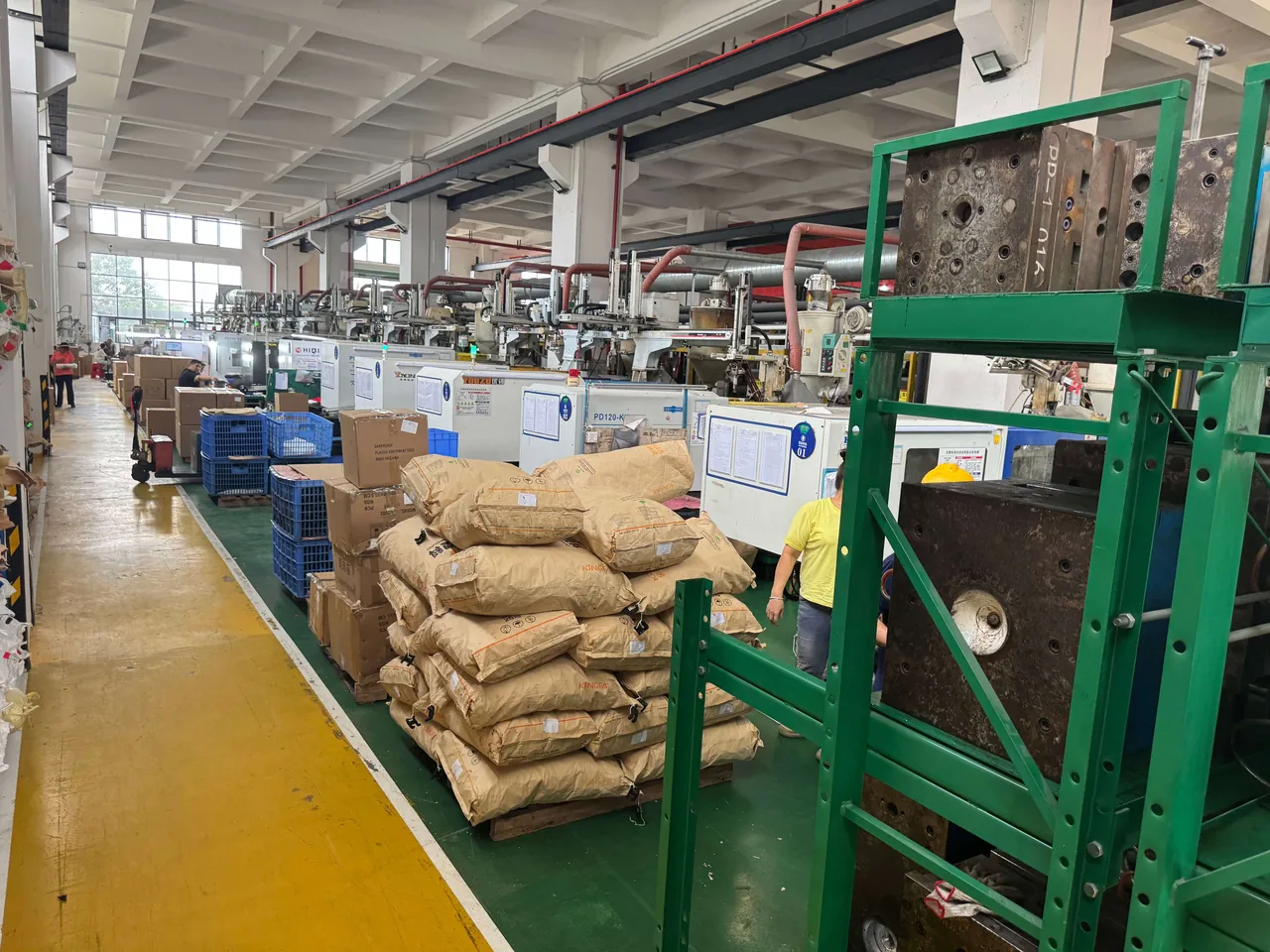
Dark and highly saturated colors are popular on protective cases, but they are noticeably harder than mid tones.
Challenge one, high opacity demand. Dark shades must cover the substrate undertone, requiring sufficient pigment concentration, which raises masterbatch cost and addition ratio, and can affect mechanical properties.
Challenge two, sink marks and flow marks show more. A dark surface amplifies the visual contrast of surface defects. The same sink mark is nearly invisible on a light part and obvious on a dark one. Dark cases therefore place higher demands on mold and process.
Challenge three, lower tolerance for deviation. The eye is more sensitive to lightness differences in dark shades, so a small Delta L shift is more readily detected. Dark part acceptance generally requires tighter component control.
Challenge four, fading reads more strongly. When a highly saturated color fades, saturation drops, and the visual change is more pronounced than in a low saturation shade. Outdoor applications need particular attention to pigment weathering grade.
Challenge five, interaction with flame retardant systems. Some flame retardants and pigments interact, causing color shift or affecting flame retardance. This must be validated at the formulation stage.
7. Special Issues with Light and White Cases
Light and white shades look easy but have their own difficulties.
Opacity is the first hurdle. Substrate undertones run yellow or beige, so white needs sufficient titanium dioxide or equivalent white pigment to override them. Insufficient pigment content produces a gray or yellowish cast. Thin walls make opacity harder still.
Yellowing is the second hurdle. Some materials yellow under high processing temperature or prolonged sunlight, and white parts are extremely sensitive, with the change visible to the naked eye. Outdoor white cases should use an anti-yellowing system validated by aging testing.
Soiling and scratches are the third hurdle. Light surfaces show dirt and scratches more readily, so perceived quality degrades faster in service than on dark cases. Where the operating environment involves oils or abrasion, coordinate with the surface treatment design.
Color difference judgment is the fourth hurdle. On light parts, a Delta b shift toward yellow or blue is more noticeable than a Delta L shift, so acceptance rules for light shades often cap Delta b separately.
8. Color Difference Judgment and Acceptance Standards
Acceptance rules should be agreed in writing before the first order, covering judgment method, light source conditions, observer requirements, and sampling ratio. The framework below can serve as a starting point, with specific values negotiated between the parties.
| Grade | Overall deviation tendency | Component limit approach | Applicable scenario |
|---|---|---|---|
| --- | --- | --- | --- |
| Excellent | Very small | All components within tight limits | Same batch, adjacent appearance parts on one unit |
| Good | Small | Overall value passes, components within relaxed limits | Normal batch acceptance |
| Acceptable | Moderate | Requires comparison under a standard light source | Non-appearance surfaces, internal parts |
| Nonconforming | Obvious | Beyond the negotiated limit | Rework or concession required |
Four execution points matter. First, specify the light source. Common practice uses a standard light booth at an agreed color temperature, avoiding judgment under mixed lighting. Second, specify observer and angle. Multiple independent observers taking the majority view, with viewing angle and distance fixed. Third, specify the background. Background color strongly affects visual judgment and should match the actual assembly background. Fourth, specify sampling. Sample by batch rather than taking a single piece, retain the signed standard plate, and keep each judgment record.
Color measurement itself has established international method families, such as the ISO 7724 and ASTM E308 series. Instrument measurement and visual judgment should be used together: the instrument for quantification and traceability, the eye for confirming actual appearance.
9. Weathering and Fading: Aging Validation Essentials
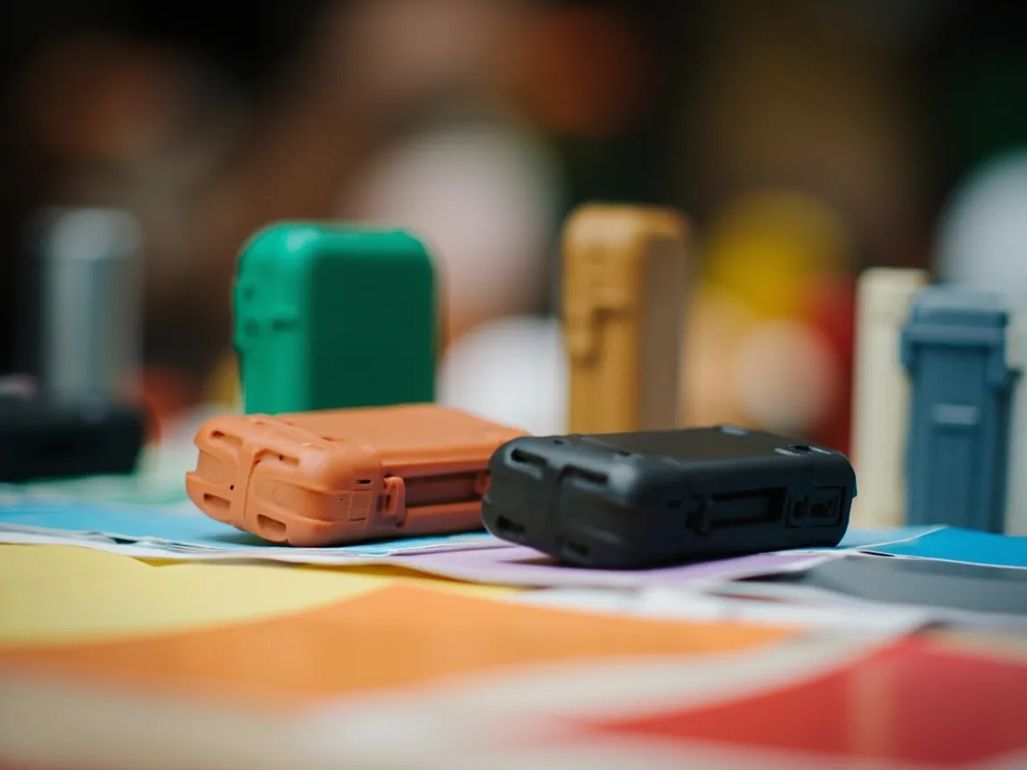
For outdoor cases, color must be considered together with weathering. The validation approach follows.
Artificial light aging is typically conducted per the ISO 4892 series, choosing a light source and cycle close to the intended environment, assessing color deviation and appearance degradation. Color fastness method families such as ISO 105 can assess color stability under specific conditions, particularly where friction, perspiration, or solvent contact is involved. Salt spray per ISO 9227 neutral salt spray targets metal parts and surface coatings, and should be included where the case carries metal components or printed markings.
Empirically, fading complaints concentrate in two scenarios: long-term outdoor sunlight and hot humid environments. The end-use environment should therefore be stated at the inquiry stage rather than addressed after a complaint appears.
Validation conclusions should land on specific metrics: a Delta E ceiling after a specified aging duration, an acceptable appearance level covering chalking, blistering, and noticeable gloss loss, and retained samples for later comparison.
10. Compatibility Between Flame Retardant Materials and Color
Protective case bodies may carry a flame retardance requirement such as a UL94 class. Three interactions between color and flame retardance deserve attention.
First, pigment and flame retardant interaction. Some pigments can affect the decomposition behavior of a flame retardant, reducing performance, while some flame retardant systems can in turn affect pigment development.
Second, the effect of addition ratio. An excessive masterbatch ratio changes the overall formulation balance, which in principle can affect the flame retardance rating determination. Once the color plan is set, recheck that the formulation ratio remains within the originally validated range.
Third, surface treatment and coatings. Where a large printed area or coating is applied to a flame retardant case, some customer standards treat it as a change in surface state requiring reassessment. Confirm this with the customer during marking process selection, as covered in five branding methods compared.
The conclusion: for flame retardant programs, the color plan must be evaluated together with flame retardance validation, not locked first and validated later.
11. Color Plates and Batch Consistency Control
The color plate is an indispensable step and the foundation of batch consistency.
Step one, confirm the baseline. Establish the Pantone system of the target reference, the material and surface condition of any reference part, and the color difference judgment conditions.
Step two, produce the color plate. The plate must use the same material and masterbatch as production and be molded on the same texture or surface finish. Matching color on a smooth test coupon and then moving to the production mold is the most common cause of a plate that passes while production fails.
Step three, sign and seal the standard. Both parties sign and retain the standard color plate with date and revision noted. All later batches are judged against it.
Step four, production control. Lock the masterbatch addition ratio, barrel temperature profile, and residence time, establish a color check rhythm at first article, mid batch, and batch end, and retain the judgment records for every lot.
Step five, lot traceability. Record masterbatch lot number, production date, and corresponding product batch so that problems can be scoped quickly.
| Control point | Inspection content | Record requirement |
|---|---|---|
| --- | --- | --- |
| Masterbatch receiving | Lot number, appearance, preliminary comparison to the standard plate | Incoming inspection record |
| Dosing | Addition ratio, mixing uniformity | Dosing sheet |
| First article | Color comparison against the sealed standard plate | First article color record |
| Mid batch | Periodic checks of color stability | In-process inspection record |
| Batch end | Comparison to the first article confirming no drift | Batch end record |
| Shipment | Sample retention and filing | Retained sample and shipment record |
12. Cost, Minimum Order, and Lead Time Impact
Color affects cost in three places.
Masterbatch cost: a custom color requires development or matching fees and is subject to a minimum order quantity. Where the color needs high opacity or a special weathering grade, unit masterbatch cost rises.
Changeover and purge cost: switching colors requires purging, and going from dark to light demands far more purge work than light to dark. Scheduling therefore usually runs light to dark, and small batch multi-color orders add changeover cost and material loss noticeably.
Sampling and validation cost: color plate production, aging validation, and flame retardance rechecks all consume money and time. Where multiple sampling rounds are required, lead time extends significantly.
Ways to reduce color cost include choosing the nearest existing color from the supplier's palette, reducing the number of colors on one case, planning color customization together with batch size to avoid small batch custom masterbatch, and settling surface texture and color at the design stage rather than adjusting after molding.
13. How JUNZHJIA Supports Color Matching
JUNZHJIA, manufactured by KeXin New Materials (Guangdong) Co., Ltd. at its Zhongshan facility, provides color matching support across protective cases, toolboxes, military weapon cases, and waterproof junction boxes. The standard workflow is: the customer provides the target Pantone reference and system, the factory assesses feasibility against the case material and surface condition, proposes either a close existing color or a custom masterbatch plan, and completes color plate production, sealing, and volume production. For programs with flame retardance or outdoor weathering requirements, the compatibility constraints of the material system and the validation path can be explained. Color planning is usually done together with insert and marking processes to avoid rework from locking color first and adding processes later. Achievable gamut, color difference conditions, minimum order quantity, and lead time are assessed against material system, surface texture, and order scale, so supply the target reference, material type, surface condition, and end-use environment with the inquiry.
14. Resolving Common Color Complaints
When a color complaint arrives, the response should be a diagnosis rather than an immediate rework instruction. The first branch point is whether the deviation is consistent across the whole batch or varies within it. A consistent offset points to the masterbatch or the formulation. A varying offset points to the process or the dosing operation.
Case one, the whole batch is uniformly lighter or darker than the standard. This is a formulation or ratio issue. Check whether the masterbatch lot matches the sealed reference, then verify the addition ratio against the locked value. Do not adjust the ratio before confirming the masterbatch lot, because compensating for a wrong lot with an adjusted ratio creates a batch that matches visually while sitting outside the validated formulation.
Case two, color drifts across the batch. This is a process stability issue. Barrel temperature, residence time, and shear heat all shift color, and the drift usually appears as a gradual change from the start of the run to the end rather than a step change. Review the temperature profile against the locked settings, check whether regrind was introduced mid-run, and compare first article, mid batch, and batch end records to see the trend.
Case three, two suppliers or two molds disagree. This is almost always a mold or surface issue rather than a color issue. Different texture depth scatters light differently, and the same masterbatch on a deeper texture reads lighter and flatter. Confirm that both parts use the same texture specification before touching the color. If the texture genuinely differs, the colors will never match visually no matter how precisely the masterbatch is matched.
Case four, the customer sees a mismatch that the instrument does not. Recheck the observation conditions before disputing the claim. Background color, light source spectrum, and viewing angle frequently explain a disagreement that instrument measurement cannot reproduce. Compare side by side, under the agreed light source, on the agreed background, with the sealed standard plate. Where the customer's own judging condition differs from the agreed one, the fastest resolution is usually to align on conditions rather than to change the product.
Case five, the color fades in service. Fading cannot be corrected by reformulation after the fact if the pigment system lacks the required weathering grade. Confirm the end-use environment, review the aging validation results against the intended exposure, and if the grade is insufficient, change the pigment system rather than adjusting the shade. Where the complaint concerns a dark or highly saturated shade, expect the visual change to be more pronounced than the measured value suggests, because saturation loss is conspicuous to the eye.
Empirically, complaints that appear to be color problems turn out to be surface, lighting, or process problems roughly half the time. Diagnose the branch first. Replacing masterbatch for a problem that lives in the texture specification wastes a sampling cycle and leaves the real cause in place.
Frequently Asked Questions
Q: Can protective case colors be customized?
A: Yes, but freedom is bounded by three constraints. The first is the material system, since the same reference renders differently on PP, ABS, and PC, and a naturally yellow or beige undertone affects how easily light shades can be achieved. The second is the masterbatch minimum order quantity, because the color house sets a threshold and the molder must buy the full lot even for a small run, placing the economic threshold at the masterbatch stage rather than at injection. The third is surface condition and lighting, since deeper texture increases diffuse reflection and makes the same reference look lighter and flatter, while different light sources produce different judgments. Color customization is therefore a full chain from material confirmation and masterbatch formulation through color plates, pilot production, and color difference acceptance, not a matter of quoting a reference number.
Q: Can I just quote a Pantone reference and have it produced?
A: No. A Pantone reference is the starting point of communication, not the end point. Note first that Pantone spans multiple systems, including the textile and home system and the graphic system, where the same number uses different formulations and renders differently, so quotations and samples should state the system. Second, paper swatch books drift after long exposure to light, so rigorous acceptance should rely on a standard color plate signed and sealed by both parties rather than an aged book. Third, a reference number is only a target, and deviation needs quantifying. Standard practice computes color difference in the CIELAB space using overall Delta E together with Delta L for lightness and Delta a and Delta b for chromatic deviation. Empirically, small differences are hard to see on the same material and surface, but when Delta L alone is large, the eye readily detects a lightness mismatch.
Q: Why does the same color look different on different materials?
A: Because materials differ in natural undertone, light scattering, and pigment response. PP and PE are milky and semi-transparent, ABS runs cream to beige, PC is slightly yellow and transparent, and filled or modified compounds present microscopically uneven surfaces from filler distribution. Light and white shades need enough opacity to override the substrate undertone, and dark shades need enough pigment concentration to cover it. Texture depth directly affects diffuse reflection, so the same reference looks lighter and flatter on deep texture and darker and more saturated on smooth or glossy surfaces. When a customer asks for an exact match to a reference part, confirm first whether that part uses the same material and surface finish, because otherwise color matching lacks a common baseline.
Q: Where does color deviation come from?
A: It breaks into five sources. At the masterbatch stage, pigment lot variation and dispersion drift cause hue shifts between lots. At the dosing stage, loose ratio control or weighing error produces depth differences between batches of the same formula. At the molding stage, barrel temperature, residence time, and shear heat differences change color across the day on one mold. At the surface stage, texture depth and light scattering produce appearance differences from the same reference. At the observation stage, light source spectrum, viewing angle, and background cause inconsistent judgment. Empirically, the largest share of batch complaints comes from molding drift and inconsistent observation conditions rather than the masterbatch itself, so the first step is usually to standardize judgment conditions.
Q: Which is harder, dark or white?
A: Their difficulties differ. Dark shades demand high opacity, show sink marks and flow marks more readily, tolerate less deviation, read fading more strongly, and may interact with flame retardant systems. A dark surface amplifies defect contrast, so a sink mark nearly invisible on a light part is obvious on a dark one, placing higher demands on mold and process. White faces the opposite set of problems: opacity requires enough white pigment to override the substrate undertone, and insufficient content produces a gray or yellowish cast. Some materials also yellow under high processing temperature or prolonged sunlight, to which white parts are extremely sensitive. Light surfaces additionally show dirt and scratches sooner, and in judgment, a Delta b shift is more noticeable than a Delta L shift.
Q: How should color deviation be judged and accepted?
A: The rules should be agreed in writing before the first order and cover judgment method, light source conditions, observer requirements, and sampling ratio. Four execution points matter. Specify the light source, commonly a standard light booth at an agreed color temperature, avoiding judgment under mixed lighting. Specify observer and angle, with multiple independent observers taking the majority view and the viewing angle and distance fixed. Specify the background, since background color strongly affects visual judgment and should match the actual assembly background. Specify sampling, taking samples by batch rather than a single piece, retaining the sealed standard plate, and keeping the judgment records. Color measurement has established international method families, and instrument measurement should be combined with visual judgment, using the instrument for quantification and traceability and the eye for confirming appearance.
Q: Will an outdoor case fade?
A: It will. Fading is the natural result of a pigment system under the combined action of light, heat, and moisture, though the degree depends on pigment weathering grade and the operating environment. Validation typically uses artificial light aging per the ISO 4892 series, choosing a light source and cycle close to the intended environment and assessing color deviation and appearance degradation. Where friction or solvent contact is involved, color fastness method families can be referenced, and where the case carries metal components or printed markings, salt spray validation should be added. Empirically, fading complaints concentrate in long-term outdoor sunlight and hot humid environments, so state the end-use environment at the inquiry stage rather than addressing it after a complaint. Conclusions should land on specific metrics including a color deviation ceiling after a set aging duration.
Q: Does color affect the flame retardance rating?
A: It can, and this should be assessed in advance. Three interactions deserve attention. First, pigments and flame retardants may interact, with some pigments affecting the decomposition behavior of the flame retardant and reducing performance, while some flame retardant systems affect pigment development. Second, an excessive masterbatch ratio changes the overall formulation balance, which in principle can affect the rating determination, so once the color plan is set, recheck that the ratio remains within the originally validated range. Third, where a large printed area or coating is applied to a flame retardant case, some customer standards treat it as a change in surface state requiring reassessment. The conclusion is that for flame retardant programs, the color plan must be evaluated together with flame retardance validation rather than locked first.
Conclusion and Further Reading
Color customization on protective cases is feasible, but it is not a single conversation. It is a chain running from material confirmation to batch acceptance. Before starting, settle the three constraints: the material system frames the achievable gamut, the masterbatch minimum sets the economic threshold, and surface condition with light source sets the judgment conditions. During execution, hold five steps: define the Pantone system and target reference, produce a color plate using the actual material and the same texture, have both parties sign and seal the standard, lock the addition ratio and process profile in production with first article, mid batch, and batch end color checks, and retain shipment samples while tracing masterbatch lots. For outdoor and flame retardant programs, schedule color together with aging validation and flame retardance rechecks. JUNZHJIA assesses color feasibility against material system, surface texture, and order scale, proposes close existing colors or custom masterbatch plans, and completes color plates, sealing, and volume production, with the final plan determined by actual assessment.
Further Reading