

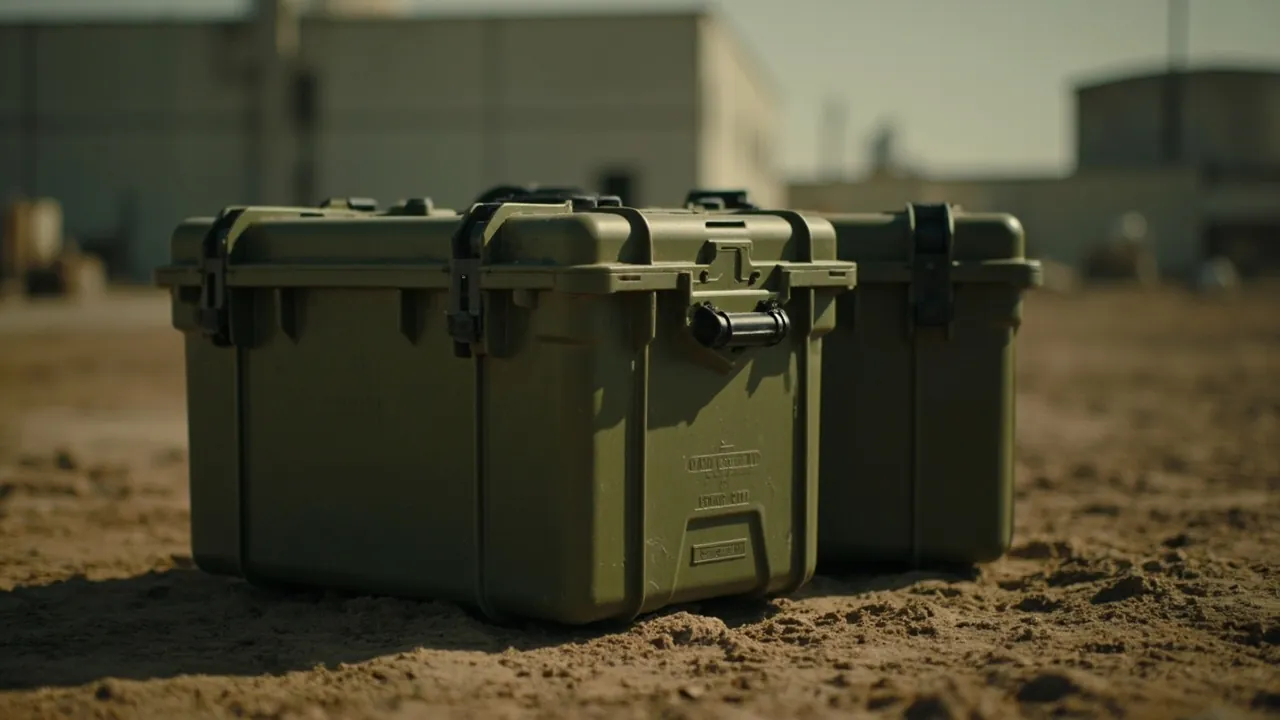
Short answer: military-specification cases are mostly green, typically olive drab or military green, primarily for functional rather than aesthetic reasons. Green has low contrast and low reflectance in natural outdoor environments, which reduces the chance of the case being visually identified at distance, and it also supports consistent identification and inventory management across an equipment system. In other words, green is an engineering choice for reducing visibility: it cuts reflection, lowers outline contrast and softens edges against vegetation and soil backgrounds. On top of that, green also brings supply-chain standardisation, coating durability and process cost and stability advantages. So when you see an olive-green case, you are looking at a comprehensively weighed material and coating solution, not a random colour. This article breaks down the engineering logic behind green, from visibility management, military colour standards, coating systems, pigments and weathering, optical signature, thermal management, standardisation and supply chain, plastic colouring and metal coating, test standards and a procurement checklist.
A common procurement question is why other colours cannot be used. Other colours can certainly be used, and many civil protective cases are black, orange or yellow. The choice depends on the application: where low visibility is required for long outdoor storage and transport, green is a reasonable choice; where high recognition is needed, such as emergency rescue, industrial maintenance and outdoor sports, a saturated orange or yellow is actually better, because being easy to find matters more than being hard to see. Understanding the functional trade-off behind colour lets you choose by application rather than treating a colour as a badge of "military equals premium". This article restores colour to an evaluable, testable and acceptable technical specification.
Table of Contents
- Short Answer: Green Is a Functional Choice, Not an Aesthetic One
- The First Function of Colour: Reducing Visibility and Reflection
- Military Colour Standards: FS 595 and Olive Drab
- Coating Systems: Primer, Topcoat and Curing
- The Relationship Between Pigments and Weathering
- Managing Optical and Infrared Signature
- The Real Relationship Between Colour and Thermal Management
- Standardisation and Supply Chain: Why One Green
- Colouring Plastic Cases: Masterbatch and Weathering
- Coating Metal Cases: Pre-treatment and Adhesion
- Test Standards for Coating Performance
- Procurement Checklist
- Custom Colours and OEM
- FAQ
- Conclusion and Related Reading
Short Answer: Green Is a Functional Choice, Not an Aesthetic One
Treating colour as a design style is a common misconception. In industrial packaging and equipment, colour is a functional specification alongside structure, material and sealing, serving the application.
Four functional dimensions of green:
- Reducing visibility. Against vegetation, soil and woodland backgrounds, green is close to the background in hue and lightness, giving low visual contrast, so it is hard to identify at distance. This is the primary functional requirement.
- Reducing reflection. By controlling the surface gloss of the coating, specular reflection under direct sunlight is reduced, avoiding a bright spot visible at distance. Low reflection often matters more to long-range recognisability than the colour itself.
- Unified identification. In an equipment and materials system, a uniform colour is itself classification information, easing warehousing, stocktaking and matched management and reducing mixed-load errors.
- Coating functionality. Green pigments, such as chromium oxide green and phthalocyanine green systems, often strike a good balance between weathering resistance, hiding power and cost, which suits large-scale use.
Application decides colour. Opposite to green is the need for high visibility: emergency rescue, road works, outdoor sports and industrial maintenance, where orange, yellow or fluorescent colours fit better because the object must be found quickly. Both needs are essentially visibility management, only in opposite directions. Whether a colour is reasonable should therefore be judged against the visibility goal of the application.
The table below sets out visibility goals and recommended colour families by application, for direct use in selection discussions.
| Application | Visibility goal | Recommended colours | Notes |
|---|---|---|---|
| --- | --- | --- | --- |
| Long outdoor storage, field transport | Low visibility | Military green, olive drab, sand | Low contrast with natural backgrounds, low reflection |
| General warehousing and logistics | Neutral | Black, dark grey, military green | Dirt-resistant, universal, easy to match |
| Emergency rescue, fire service | High visibility | Orange, yellow, fluorescent | Must be found quickly |
| Road works, traffic facilities | High visibility | Orange, yellow plus reflective marking | Recognition by day and night |
| Industrial maintenance, equipment | Medium-high visibility | Yellow, blue, red | Aids zoning and identification |
| Outdoor sports, outdoor gear | High visibility | Vivid or contrasting colours | Reduces loss and eases finding |
| Brand customisation, corporate identity | Per brand guidelines | Brand colour | Evaluate appearance separately from protection |
One sentence: the value of green is reducing the probability of being identified, which is the functional optimum for low-visibility scenarios; in a scenario where the object must be found quickly, that becomes a drawback.
The First Function of Colour: Reducing Visibility and Reflection
Reducing green to an engineering problem means solving how to make a relatively large case inconspicuous outdoors. Three quantifiable factors are involved.
Factor one: hue contrast. Human colour perception relies on hue, lightness and saturation. Against woodland and grass, green is close in hue; a saturated red or blue differs greatly in hue and is noticed at distance. A low-contrast choice essentially brings all three dimensions close to the background.
Factor two: lightness matching. Lightness difference is perceived at longer range than hue difference. Military green is usually not a vivid pure green but a blended, lower-lightness grey-green, often called olive drab, precisely to reduce the lightness difference against natural backgrounds. This also explains why military green often looks greyish and dark.
Factor three: surface reflection. This is the most easily overlooked yet most critical. Even with matching colour, a high-gloss surface produces specular reflection under direct sunlight, creating a bright zone visible at distance. Outdoor cases therefore usually have a matte or semi-matte surface, controlling gloss, often measured as 60-degree gloss, to suppress reflection. Reflection control often matters more than colour itself.
The design trade-off. Reducing reflection usually means a rougher coating surface or a matting agent, which can affect dirt resistance and cleanability. The matte level must therefore balance low reflection against easy maintenance, which is why the same "military green" can look and feel different across products.
Military Colour Standards: FS 595 and Olive Drab
To make colour reproducible and acceptable, military systems established colour standards. The most frequently cited is the United States federal standard FS 595, Federal Standard 595, Colors Used in Government Procurement, which defines many standard colours by number, including several green families widely used to specify equipment and packaging colours.
What FS 595 does. It turns "military green" from a vague adjective into a deliverable colour number, so that products from different suppliers and batches can be aligned. Specifying a colour number is far more precise than saying "military green". It is supported by colour measurement and colour-difference evaluation, usually controlling batch consistency by colour difference, or delta E.
Origins and features of olive drab. Olive drab, often abbreviated OD, is one of the oldest and most widely used military greens. It tends toward yellow-green in hue, with low lightness and modest saturation, between green and grey-brown. This "impure" green is precisely its function: it covers woodland, grass and soil backgrounds at once, giving broad adaptability. Several shades of olive drab evolved for different environments.
Why standardisation matters. With a unified colour number, colour moves from "inspect each batch" to "deliver to standard". The supply chain can therefore stay consistent across suppliers and batches, reducing matching problems and rework from colour differences. For the evolution of case materials and colouring tradition, see the evolution of military storage case materials.
Relation to other colour families. Besides green, military systems also define sand, earth yellow and brown numbers for different environments. "Military equals green" is therefore not entirely accurate; the accurate statement is that military systems define colours by environment, and green is the most widely applied family.
Coating Systems: Primer, Topcoat and Curing
Colour is ultimately carried by the coating. A metal case coating is usually a multi-layer system, each layer serving a different function, and colour is only one property of the outermost layer.
Layer one: pre-treatment. Before coating, the metal surface must be cleaned, degreased and derusted, and a conversion film formed, such as phosphating or passivation, to improve adhesion and corrosion resistance. Pre-treatment quality often determines coating life more than the paint itself. Poor pre-treatment will peel even the best topcoat, consistent with the overall rust-prevention logic in how to prevent rust in metal tool boxes.
Layer two: primer. The primer provides adhesion and corrosion protection, commonly epoxy or polyurethane with anti-rust pigments. Its colour is usually not the final colour but affects the hiding of the topcoat.
Layer three: topcoat. The topcoat provides the final colour, weathering resistance and surface texture. A green topcoat commonly uses polyurethane or modified alkyd systems, with pigments and additives setting hue, lightness and gloss. Topcoat weathering, meaning resistance to ultraviolet, chalking and fading, determines how long the colour lasts.
Curing and process parameters. Final coating performance depends on curing conditions: temperature, time and film thickness. Too thin gives poor hiding and protection; too thick tends to crack and lose adhesion. Coating is therefore a result of formulation plus process, and colour alone says nothing about quality.
Plastic cases are not coated. Most engineering-plastic cases are coloured throughout using masterbatch rather than surface coating. Their green is therefore the colour of the material itself, with better scratch resistance than a coating, but the adjustable colour range and surface texture control differ. For a full comparison of plastic and metal cases, see engineering plastic versus ordinary plastic case bodies.
The Relationship Between Pigments and Weathering
Colour is not simply adding a little dye; the pigment system directly determines coating weather life. This explains why two products of the same green differ markedly after a few years.
Inorganic versus organic pigments. Inorganic pigments, such as chromium oxide green and iron oxide systems, generally have better weathering, light resistance and heat resistance, but their hue is darker and less vivid. Organic pigments, such as phthalocyanine green, are more vivid with stronger tinting strength, but some grades have weaker light resistance. Green systems often blend the two to balance hue and weathering.
Mechanisms of fading and chalking. Ultraviolet light breaks chemical bonds in the pigment and resin, causing fading, where the colour lightens or shifts, and chalking, where surface resin degrades and pigment particles are exposed. The weather resistance of an outdoor case depends on the combination of resin and pigment systems, and on whether ultraviolet absorbers and light stabilisers are added.
Colour depth and weathering. Generally, darker coatings absorb more solar radiation and run hotter at the surface, accelerating resin ageing; lighter coatings run cooler but may show dirt more. Green sits in between, balancing low visibility against a relatively moderate heat load, one reason for its long use in many environments.
Testing and acceptance. Weathering cannot be judged by eye; accelerated ageing data is needed. Common methods include ultraviolet ageing, such as ASTM G154 type methods, and salt spray testing to ISO 9227, the former for colour and gloss retention, the latter for corrosion protection. Request the corresponding ageing data rather than judging only the new product colour. For overall material selection and weathering, see how to choose outdoor case materials.
Managing Optical and Infrared Signature
Beyond visible light, an object has a broader electromagnetic signature. While green reduces contrast in the visible band, near-infrared reflectance also needs consideration, which falls within signature management.
Visible versus near-infrared. The human eye perceives only visible light, whereas modern observation equipment can cover near-infrared bands. If a pigment appears green in visible light but its near-infrared reflectance differs greatly from natural vegetation, it may still form high contrast under the relevant equipment. Where requirements are high, pigments are therefore chosen to approach natural backgrounds in both visible and near-infrared.
The metamerism phenomenon. Different pigment combinations may look the same under one light source but behave differently under another source or band. This is common in colour engineering and shows that colour matching must state the conditions under which it is matched. For general industrial packaging, meeting colour difference in visible light is usually enough; where signature management is required, the band range must be extended.
What this means for procurement. Most civil and general industrial applications do not need extended-band requirements and only need visible colour difference and surface gloss controlled. Where a project has special requirements, state the band range and test method in the technical agreement rather than writing "military green" loosely. For application scenarios, see how to choose a tactical storage box.
Surface structure and signature. Beyond colour, surface texture affects reflection and scattering. A matte, textured surface scatters reflected light and reduces specular highlights, lowering long-range recognisability. This is the second visibility-reduction tool beyond colour.
The Real Relationship Between Colour and Thermal Management
Outdoors, colour affects solar absorption and thus the case's surface temperature. This is a factor that is often exaggerated but does have an effect, and should be viewed objectively.
Absorptance and surface temperature. A darker surface absorbs more solar radiation and runs hotter; a lighter surface reflects more and runs cooler. Internal temperature depends on surface temperature, wall thickness, material conductivity, ventilation and internal heat sources. The claim that "green cases run hotter" is only meaningful under identical conditions, and dark green is hotter than light green, while olive drab is not the darkest colour.
Effect on contents. If contents are temperature-sensitive, such as certain electronic components, batteries, optical parts or adhesives, a higher internal temperature shortens life or affects performance. Colour choice should then be considered together with thermal management: while still meeting low visibility, a relatively lighter green or a reflective coating helps reduce surface temperature rise. For systematic temperature and protection design, see high and low temperature adaptation for outdoor cases.
Thermal cycling and sealing. Temperature change alters internal pressure, repeatedly stressing the seal. Environments with frequent thermal cycling should have a pressure equalisation valve, which goes together with the waterproof design; see outdoor case pressure equalisation valves.
An objective conclusion. Colour does affect thermal management, but in most scenarios it is not the dominant factor, and structure and material usually matter more. Choose colour primarily by the visibility requirement, treating thermal management as a secondary factor to assess in parallel, not the other way round.
Standardisation and Supply Chain: Why One Green
From a supply-chain view, moving to a single green has a very practical reason: standardisation brings efficiency and cost advantages.
Fewer categories, higher efficiency. If every item had a colour customised to its own scenario, coating and colour categories would explode, leading to small batches, many variants, frequent line changes, higher cost, longer lead times and complex inventory. Unifying to a few standard colours greatly simplifies production and inventory.
Easier identification and matching. In warehousing and transport, colour is itself classification information. A uniform green helps identify case categories quickly, reduces mixed loading and mis-shipment, and eases matching, with case bodies, linings and accessories managed in the same batch.
Cross-supplier consistency. A standard colour number aligns products from different suppliers and regions, allowing the supply chain to switch capacity flexibly without affecting overall consistency. This matters greatly for large projects.
Inventory and repair. A uniform colour also eases spares and repair: touch-up and part replacement match easily, avoiding appearance inconsistency from batch differences.
The other side of cost. Standardisation also means some special colours must be customised, with higher cost and larger minimum order quantities. Buyers should understand the difference between standard and custom colours and plan colour requirements together with batch size and lead time. For customisation and OEM flow, see custom linings and deriving the case from the pack unit.
Colouring Plastic Cases: Masterbatch and Weathering
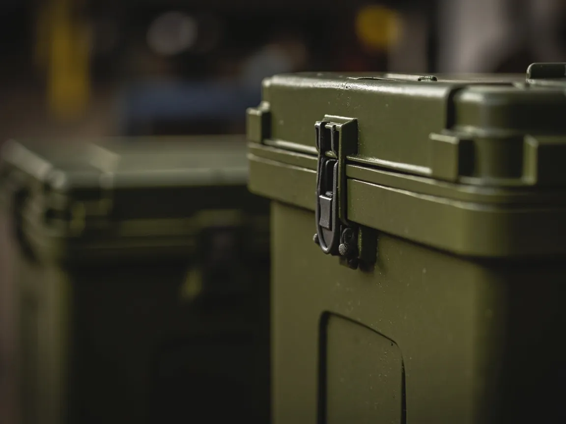
Engineering-plastic cases are coloured differently from metal cases, and understanding this allows a proper assessment of a plastic case's green.
Coloured throughout (masterbatch). Plastic case colour is usually achieved by adding masterbatch to the raw material, so the colour runs through the material. Scratch resistance is therefore good: after a surface scratch the colour is unchanged, unlike a coating that exposes the substrate. This makes plastic cases more durable in appearance under rough use.
How pigments affect material properties. Pigments and additives in masterbatch can affect mechanical properties and weathering, so they must be assessed at the formulation stage. Some pigments accelerate ultraviolet ageing, so outdoor plastic cases need weather-grade masterbatch with light stabilisers.
Ultraviolet and fading. Plastics age under ultraviolet light, showing discolouration, chalking and loss of mechanical performance. Green plastic cases also need weather-resistant formulations; colour is only an appearance metric, and long-term retention depends on the whole formulation. For comparisons between plastics, see PP, ABS and PC case materials compared.
Controlling colour consistency. Slight colour differences can occur between plastic batches, especially for dark and compound colours. Control means fixing the masterbatch supplier and formulation, specifying a colour-difference tolerance, judged for example by delta E, and agreeing sample retention in the contract. This needs to be settled earlier than for metal coating.
Surface treatment. Some plastic cases reduce reflection through mould texture, such as leather grain or fine sand grain. Texture is set by the mould and fixed once the tool is cut, so texture design should be confirmed at the mould stage. For case surface and structural design, see choosing surface finishes such as gloss and matte.
Coating Metal Cases: Pre-treatment and Adhesion
A metal case's green usually comes from a coating, and coating reliability depends heavily on pre-treatment, the biggest process difference from plastic cases.
The four pre-treatment steps. Degreasing, derusting, rinsing and conversion coating. Each has a process window, and deviation in temperature, concentration or time leads to insufficient adhesion later. Pre-treatment is the invisible process that decides whether the coating stays on for years.
Adhesion testing. Cross-cut or pull-off methods are common, the former for quick line judgement, the latter for quantified assessment. Insufficient adhesion typically shows as large-area flaking at impact points, exposing the metal and accelerating corrosion.
Film thickness control. Film thickness is a core coating quality parameter, measured with a thickness gauge. Too thin gives insufficient protection; too thick raises internal stress and tends to crack. The thickness range should be written into the technical agreement, not just the colour.
Corrosion validation. A metal case's corrosion resistance is usually evaluated with salt spray testing to ISO 9227, judged by the degree of rust after a defined time. For cases used outdoors for long periods, this is a more critical metric than colour. For related material and corrosion design, see corrosion-resistant case and enclosure design and why military steel ammo cans suit long-term storage.
Separating colour from coating acceptance. Colour is only one coating property. At acceptance, evaluate "colour matches the number" separately from "adhesion, film thickness and corrosion resistance are met", avoiding the mistake of matching only colour and ignoring performance.
Test Standards for Coating Performance
Colour and coating evaluation need standard support. The table below summarises common items and methods for citation in a technical agreement.
| Evaluation item | Common method or standard | What is evaluated | Procurement point |
|---|---|---|---|
| --- | --- | --- | --- |
| Colour and colour difference | Colour number standards such as FS 595 type, delta E measurement | Hue, lightness and saturation consistency | Specify colour number and tolerance |
| Surface gloss | 60-degree gloss measurement, such as ASTM D523 type | Matte or semi-matte level, reflection control | State a gloss ceiling |
| Adhesion | Cross-cut, pull-off | Coating-to-substrate bond strength | Mandatory for metal cases |
| Film thickness | Magnetic or eddy-current gauge | Coating thickness uniformity | Specify upper and lower limits |
| Salt spray resistance | ISO 9227 | Corrosion protection | Mandatory for long outdoor use |
| Ultraviolet ageing | UV ageing tests such as ASTM G154 type | Fading, chalking, gloss retention | Mandatory for outdoor cases |
| Coating impact | Drop-weight or impact test | Coating cracking and flaking resistance | Mandatory for transport use |
How to use it. First set the mandatory items by application, then write the standard, conditions and pass criteria into the technical agreement. For a metal case for long outdoor storage, cover at least adhesion, film thickness, salt spray and ultraviolet; for a plastic case, focus on colour difference, weathering and mechanical retention. For the full product certification set, see what certifications an ammunition transport box needs.
Procurement Checklist
The acceptance points for colour and coating, gathered into a checklist for goods-in inspection and supplier communication.
- Colour: has a standard colour number been specified; is a colour-difference tolerance agreed, judged for example by delta E; is a standard colour panel or retained sample held.
- Gloss: is a surface gloss ceiling specified; does the sample match the sealed reference.
- Film thickness: is a thickness range specified for metal cases; is a measurement record provided.
- Adhesion: is a cross-cut or pull-off test done; does it pass.
- Corrosion: is a salt spray report provided with its conditions, concentration, temperature, duration and judgement.
- Weathering: is ultraviolet ageing data provided; are colour and gloss retention acceptable.
- Consistency: is colour stable between batches; is there a retained-sample comparison mechanism.
- Documentation: is a material and coating system statement provided; does the report sample match the delivered product.
Procurement reminder: colour is one of the easiest metrics to accept and one of the least important. What really determines long-term performance is adhesion, film thickness and corrosion and weathering data, and these should be prioritised in the contract.
Custom Colours and OEM
Where the standard green cannot meet a need, for example a brand colour or a high-visibility colour, custom colouring is feasible but its boundaries and costs must be understood.
The custom colouring flow. Provide a target sample or colour number, the supplier matches and prototypes, confirm the colour panel, run a small trial, then mass-produce with retained samples. Each step should be documented to avoid colour drift after mass production.
Cost and minimum order. A custom colour usually has a higher minimum order quantity and a longer lead time, because it requires separate matching and line cleaning. Metal coating and plastic masterbatch have different cost structures and should be quoted separately.
Balancing colour and performance. Some vivid colours may need specific pigment systems whose weathering differs from standard green, so custom colours also need weathering and ageing validation, not just colour confirmation.
Choice for high-visibility scenarios. Where the application requires quick discovery, such as emergency rescue, industrial maintenance or outdoor sports, choose a saturated orange or yellow and consider reflective marking. This is the opposite of the low-visibility need, showing that colour is essentially application matching.
Brand consistency. Where a company has visual identity guidelines, a custom colour can strengthen brand recognition, but it should be evaluated separately from protection performance, ensuring that appearance needs do not sacrifice structure, sealing and weathering metrics. For overall customisation capability and product range, see military ammo box versus ordinary storage box.
JUNZHJIA, manufactured by KeXin New Materials (Guangdong) Co., Ltd., produces protective cases, tool boxes, military-specification storage cases and waterproof junction boxes, and can produce custom colours to a standard colour number or a customer sample, with linings, seals and coating or material test documentation, serving wholesale, distribution, OEM/ODM and global supply.
FAQ
Q: Why are military ammo boxes mainly green? What is the main reason? A: The main reason is reducing visibility, which is a functional choice. Against woodland, grass and soil, green is close to the background in both hue and lightness, giving low visual contrast and making it hard to identify at distance; combined with a matte surface it reduces specular reflection, avoiding a bright spot visible from afar. Three secondary reasons sit on top. First, military colour standards such as FS 595 type standards turn colour into a deliverable number, keeping it consistent across suppliers and batches. Second, green pigment systems strike a good balance between weathering, hiding power and cost. Third, a uniform colour simplifies production, inventory and identification. Green is therefore not an aesthetic preference but a combined trade-off of low visibility, standardisation, weathering and cost.
Q: Are military cases always green? Can other colours be used? A: No. Military systems define several colours by environment, including sand, earth yellow and brown for different backgrounds, so it is more accurate to say that colour is chosen by environment. Civil and general industrial applications can certainly use other colours: for low visibility in long outdoor storage and transport, green is reasonable; for emergency rescue, industrial maintenance and outdoor sports, where quick discovery matters, orange, yellow or fluorescent colours fit better, because being easy to find matters more than being hard to see. Companies can also produce custom brand colours to visual identity guidelines. Whether a colour is reasonable should be judged against the visibility goal of the application, not treated as a badge of "military equals premium".
Q: Does colour affect the temperature inside the case? Is green hotter? A: It does, but it should be viewed objectively. A darker surface absorbs more solar radiation and runs hotter; a lighter surface reflects more and runs cooler. Dark green is therefore hotter than light green, and olive drab is not the darkest colour. Internal temperature also depends on wall thickness, material conductivity, ventilation and internal heat sources, and colour is only one factor, usually not dominant. Where contents are temperature-sensitive, choose a relatively lighter green or add a reflective coating while still meeting low visibility, and combine this with structure and ventilation design. Temperature change also alters internal pressure, so frequent thermal cycling suggests a pressure equalisation valve to keep the seal reliable. Choose colour primarily by visibility, with thermal management as a parallel consideration.
Q: Why do products all called "military green" differ so much in colour? A: Because "military green" is an adjective, not a standard. To make colour reproducible and acceptable, a standard colour number and colour-difference tolerance must be specified. Sources of difference include: no colour number specified, so each supplier interprets it differently; different pigment systems, with inorganic and organic pigments differing in hue and weathering; batch variation in coating or masterbatch, with dark and compound colours more prone to difference; different surface gloss and texture, since the same colour looks different on different finishes; and different degrees of fading and chalking in use. The remedy is to specify a colour number in the contract, agree a colour-difference tolerance judged for example by delta E, seal a standard colour panel, and agree a retained-sample comparison, turning colour from "looks about right" into something acceptable.
Q: Is green more weather-resistant than black or red? A: Not in general; weathering depends on the resin and pigment combination, not the colour itself. Generally, darker coatings absorb more solar radiation and run hotter, which can accelerate resin ageing, so pure black faces more ageing stress under strong sun; some vivid organic reds and yellows have weaker light resistance and need specific formulations. Green systems often blend inorganic and organic pigments to balance hue and weathering, which gives a good overall balance, but that does not mean all greens are durable. Judge weathering by accelerated ageing data, such as ultraviolet ageing and salt spray results, rather than colour, and require the corresponding reports and agreed colour and gloss retention.
Q: What is the difference between the "green" of a plastic case and a metal case? A: The colouring method and evaluation differ. Most engineering-plastic cases are coloured throughout using masterbatch, so the colour runs through the material and scratch resistance is good: after a scratch the colour is unchanged and no substrate is exposed. But the colour is affected by masterbatch formulation and batch, so colour difference must be controlled and assessed alongside material performance, especially weathering and mechanical retention. Metal cases usually use multi-layer coating, with pre-treatment, primer and topcoat, and the colour comes from the topcoat; scratch resistance is lower than colouring throughout, and impact can flake the coating and expose the metal, but the adjustable colour range is wider and gloss and texture control more flexible. Both need weathering validation: plastic for discolouration and performance retention after ultraviolet ageing, metal for coating adhesion, film thickness and salt spray corrosion.
Q: How can colour consistency be guaranteed in mass production? A: Control it in five ways. First, specify a standard colour number or a sealed sample as the benchmark, avoiding verbal description. Second, agree a colour-difference tolerance judged by instrument measurement of delta E, with defined measurement conditions such as light source, viewing angle and instrument. Third, fix the formulation and supplier: the masterbatch or paint supplier, formulation and process parameters should be fixed, and changes revalidated. Fourth, agree a retained-sample mechanism: retain a sample each batch and compare it with the standard panel, keeping traceable records. Fifth, control surface texture: gloss and texture also affect appearance and should be agreed in the sealed reference. Together these turn colour consistency from luck into an executable standard process.
Q: If I need a brand colour, is custom colouring feasible, and what does it cost? A: It is feasible, but a higher minimum order quantity and longer lead time must be accepted, because a custom colour requires separate matching and line cleaning. The flow is typically: provide a target sample or colour number; the supplier matches and prototypes; confirm the colour panel; run a small trial; then mass-produce with retained samples. Three points to note. First, a custom colour also needs weathering and ageing validation, not just colour confirmation, because some vivid colours need specific pigment systems whose weathering differs from standard green. Second, metal coating and plastic masterbatch have different cost structures and should be quoted separately. Third, brand consistency needs should be evaluated separately from protection performance, so that appearance customisation does not sacrifice structure, sealing and weathering. JUNZHJIA can produce custom colours to a standard colour number or a customer sample with supporting test documentation.
Q: What colour and coating documents should I check in procurement? A: Six sets are recommended. First, colour documents: specified colour number, colour-difference tolerance, standard colour panel or retained sample. Second, gloss documents: surface gloss target and measurement conditions. Third, film thickness records: coating thickness range and measurement records for metal cases. Fourth, adhesion reports: cross-cut or pull-off results. Fifth, corrosion reports: salt spray testing such as ISO 9227, stating concentration, temperature, duration and judgement. Sixth, weathering reports: colour and gloss retention after ultraviolet ageing. Also confirm that the report sample matches the delivered product in structure, coating system and colour. Note that colour is one of the easiest metrics to accept and one of the least important; what really determines long-term performance is adhesion, film thickness and corrosion and weathering data, which should be prioritised in the contract.
Conclusion and Related Reading
Returning to the title question: military-specification cases are mostly green primarily for functional reasons. Green has low contrast and low reflection against natural backgrounds, effectively reducing the chance of being identified at distance, and on top of that come the standardisation benefits of military colour standards, the good weathering and cost balance of green pigment systems, and the efficiency of a uniform colour in supply chain and inventory management. Green is therefore a comprehensively weighed material and coating solution, not an aesthetic preference. Conversely, scenarios that need to be found quickly should use high-visibility colours; both are directions of visibility management.
Three practical recommendations: first, choose colour by application, deciding the visibility goal before the colour family. Second, make colour an acceptable metric, specifying a standard colour number, agreeing colour-difference and gloss ranges, and sealing a standard panel. Third, look beyond colour at performance, prioritising adhesion, film thickness, corrosion and weathering data rather than matching colour alone and ignoring long-term behaviour.
JUNZHJIA, manufactured by KeXin New Materials (Guangdong) Co., Ltd., produces protective cases, tool boxes, military-specification storage cases and waterproof junction boxes, serving wholesale, distribution, OEM/ODM and global supply, and can produce custom colours to a standard colour number or a customer sample with coating and material test documentation.
Related Reading